The data visualisation
Four sensors, read in seconds.
The product's real job was to turn four wearable sensors into something a physiotherapist could read at a glance, mid-appointment. These are three of the core assessment screens that shipped — and the decisions behind them.
Accessibility set the constraints here, not the finish. The colours that carry meaning — data series, labels, the summary numbers — clear WCAG AA, and most reach AAA, in colour contrast and in text size, because the readers are an older patient group, and because assessment screens get printed, often on a black-and-white office printer. So nothing relies on colour alone: shape, position and labels carry the reading, and colour only reinforces it. Drop the chart to a mono printer and it still says the same thing.
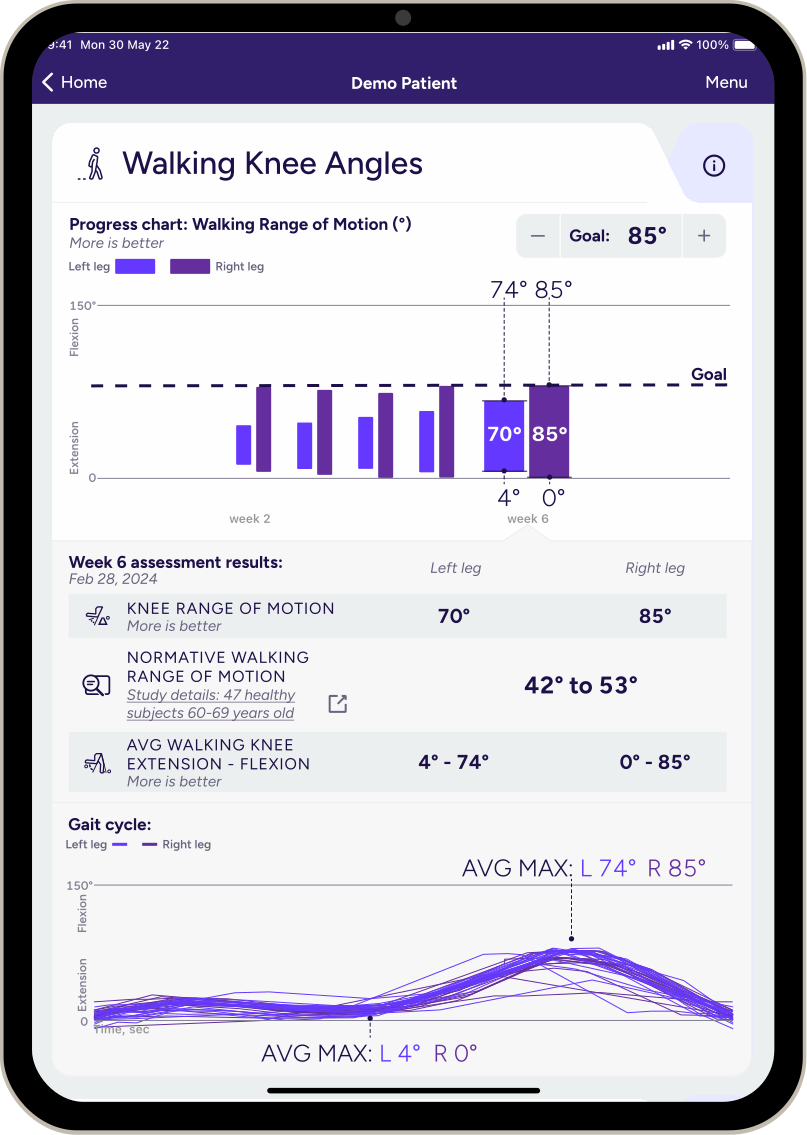
Walking Knee Angles
Chart colours are derived from the IMeasureU brand palette through lightness and saturation adjustments. The raw-data distribution is plotted beneath the summary, so a clinician sees the spread across the whole assessment — not just the headline angle.
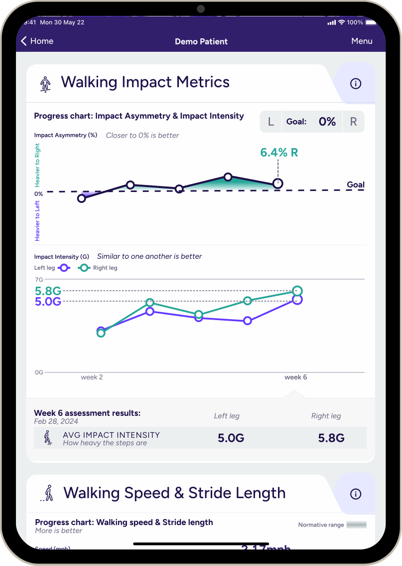
Walking Impact Metrics
Impact Asymmetry and Impact Intensity on one screen — the same asymmetry metric that anchored the IMU Step re-launch. A goal line and a plain “closer to 0% is better” rule turn raw biomechanics into a target a physio and patient can work toward together.
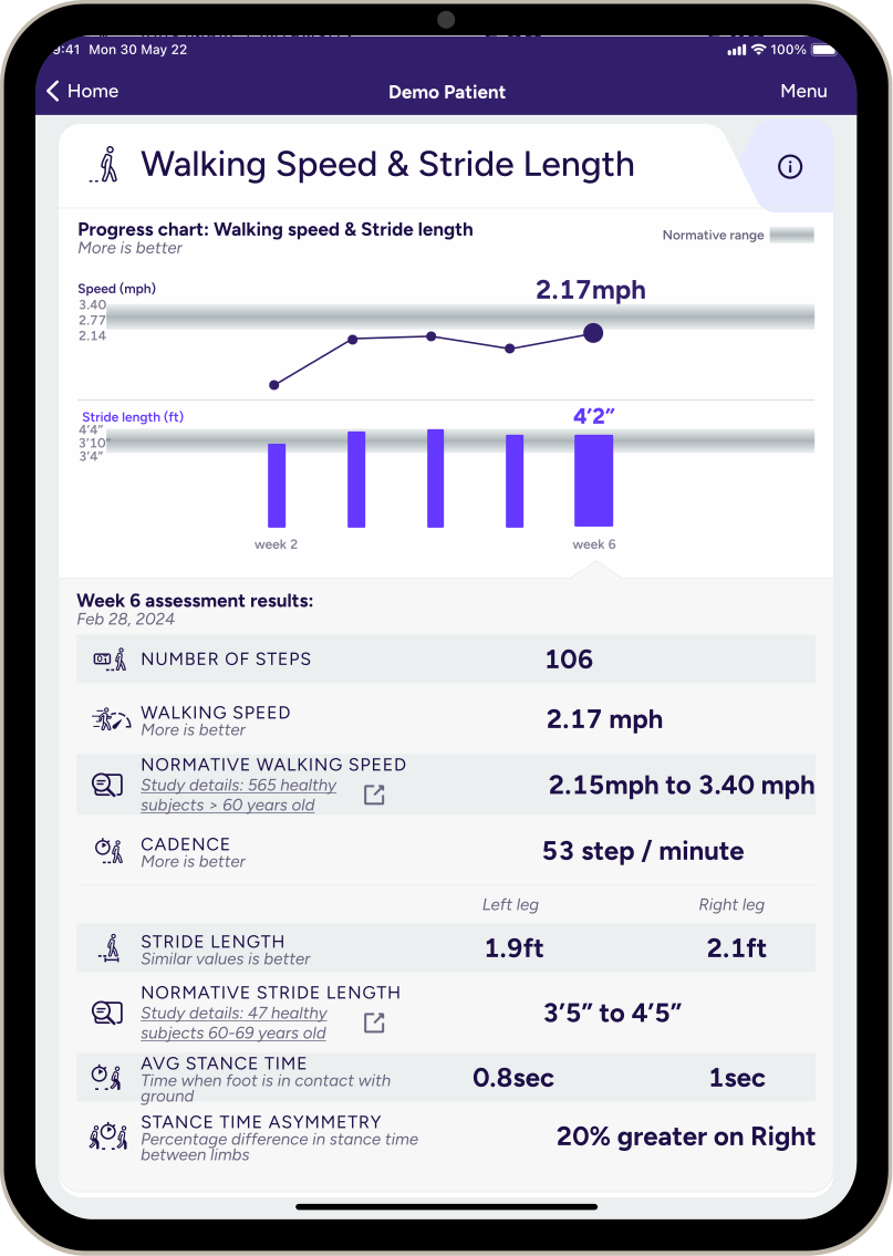
Walking Speed & Stride Length
Walking speed and stride length, plotted against a published normative range from 565 healthy subjects. The normative band gives every number a reference point, so progress reads as “approaching healthy” rather than just “going up”.